
Blog Articles
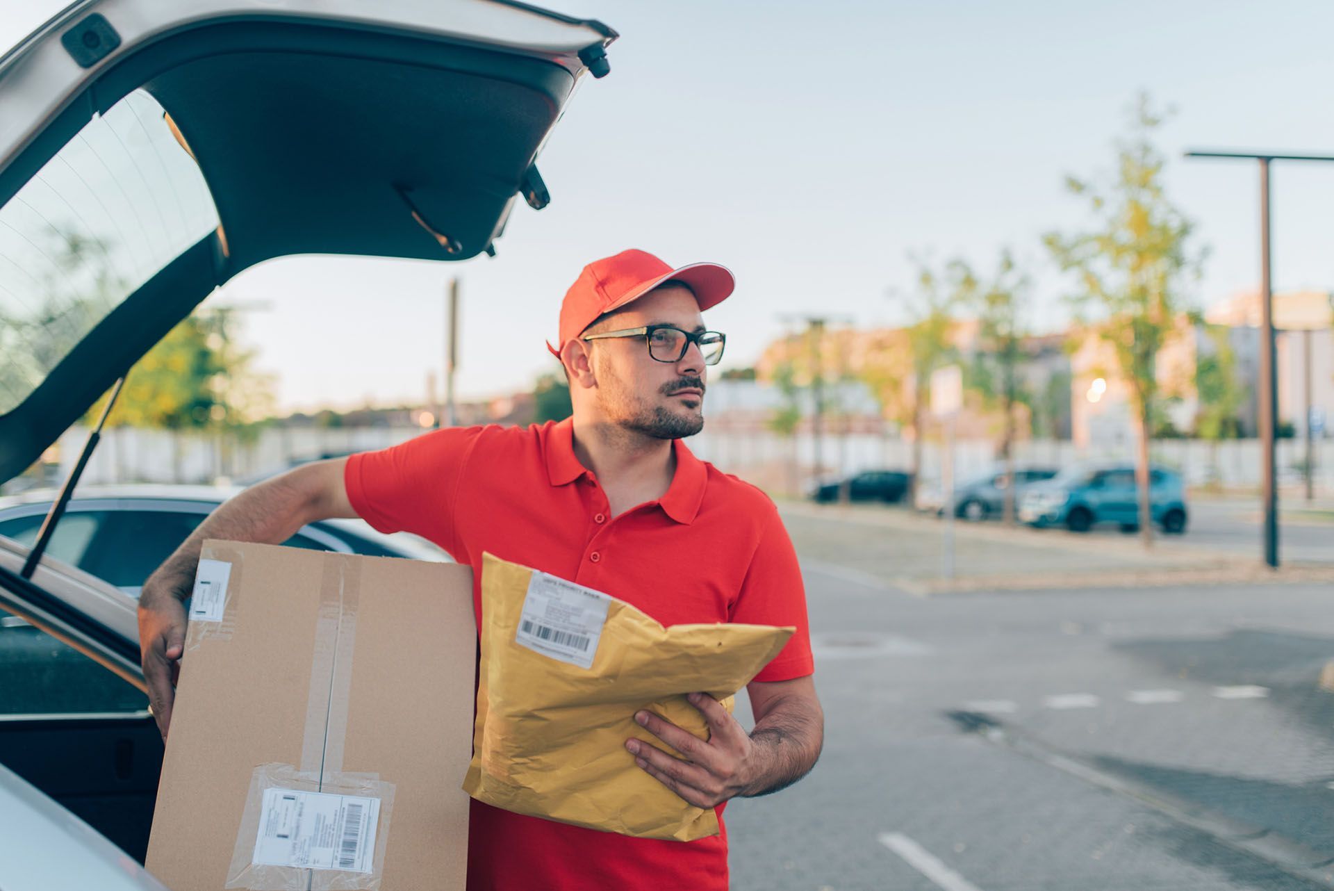
An article in Ecommerce News recently put a number to something every online retailer dreads: lost parcels. In Q4 2024 alone, European ecommerce retailers lost €500 million in revenue due to 3.72 million undelivered parcels. That’s roughly €145 per parcel in direct and indirect logistics costs. And while the official rate of “lost” parcels is just 0.06%, the reality – accounting for misdelivery, theft, and reporting gaps – is likely closer to 0.7%. That’s 1 in every 143 parcels. The Hidden Costs of a 'Lost' Delivery For enterprise-scale ecommerce operations, the implications scale fast: Lost product and packaging costs Repeat fulfilment and reverse logistics Customer service team time and refunds Increased churn and checkout abandonment Damage to brand reputation and online reviews So Why Are Parcels Going Missing? Many issues originate in the last mile of the delivery process. The root cause is often poor data quality: Incomplete or inaccurate delivery addresses captured at checkout Manual amendments to address fields by warehouse or courier staff Ambiguous delivery locations (e.g., "front porch") Lack of precise geolocation data for drop-off Inadequate or unverifiable proof of delivery Some losses are unavoidable, but most stem from gaps in ecommerce data validation and fulfilment process transparency. What Retailers Can Control with Smart Logistics Data While you can’t eliminate theft or accidents, you can reduce missed deliveries and failed first attempts through better data validation and delivery insights: Real-Time Address Validation at Checkout Fetchify’s ecommerce address validation tools connect directly with official data sources including Royal Mail PAF and the Multiple Residence dataset. This ensures accurate delivery details for apartment blocks, HMOs, student housing, and more. Unlike generic autocomplete tools, this is verified delivery point data. Rooftop-Accurate Geocoding for Pinpoint Delivery Fetchify’s Rooftop Geocodes assign precise latitude and longitude to verified addresses – helping carriers reach the exact doorstep, not just the postcode centroid. Proof of Delivery with Location and Time Stamping Our data solutions integrate seamlessly with POD technologies, supporting timestamped, geo-tagged delivery images. Customers can also submit geo-located photos during disputes, enabling faster, fairer resolutions. Map-Based Address Confirmation for Shoppers By embedding a zoomed-in map in the checkout process, ecommerce brands allow customers to visually confirm their delivery location. This prevents ambiguous or misentered addresses from the start. Audit Trails and Address Change Tracking Fetchify tracks address field edits and changes across the fulfilment chain, helping to pinpoint where a delivery went wrong and maintain data accountability. Marginal Gains. Major Ecommerce Impact. Smart logistics and address data validation might only reduce parcel loss by fractions of a percent – but the impact is huge: A 0.1% improvement = thousands of saved parcels = millions in recovered revenue Fewer failed deliveries = less pressure on customer support teams Accurate addresses = better first-time delivery success and lower last-mile costs Conclusion: Delivery Accuracy is a Data Challenge Lost parcels aren’t just a logistics challenge. They’re a symptom of poor data validation in ecommerce. From checkout to doorstep, the journey must be powered by precise, verified data. Fetchify helps online retailers solve this problem with address validation, geolocation, and enhanced fulfilment transparency. If you want to stop asking “Whose front door is this?” – start with smarter ecommerce data. Want to improve delivery success and reduce failed parcels? Contact Fetchify to book your free address data health check.

By making your website more inclusive, you can reach a broader audience, improve user experiences, and demonstrate your commitment to creating a welcoming space for all.

In the digital age, data is a critical asset for any business. Fetchify explores how data cleansing can help your business meet international standards

In the bustling world of online commerce, every detail matters. Address verification is often overlooked, and Fetchify explain why solidd data is never to be missed

Ireland’s postcode network, Eircode, was established in July 2015. Fetchify has all the knowledge on what this system is and how it works

Mobile continues to play an increasingly important part in eCommerce success. Read Fetchify's top tips on making your checkout mobile friendly.

Have your customers ever ordered something online and eagerly awaited its arrival, only to discover it was lost or delivered to the wrong address? Fetchify can help

Fetchify can help increase checkout conversions with its range of fast, accurate and intuitive data verification products. Read more here.

Over time, businesses evolve. New products are created, and new customers won. Take a look at Fetchify's new look here

